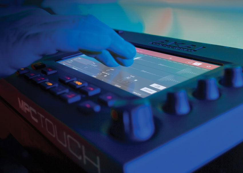
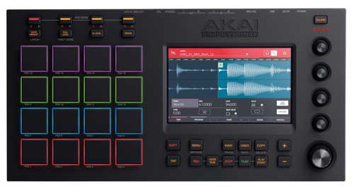
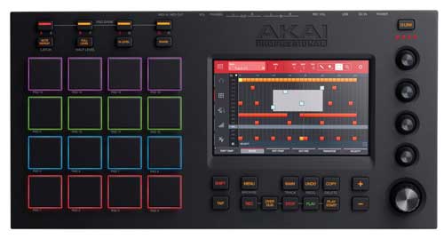
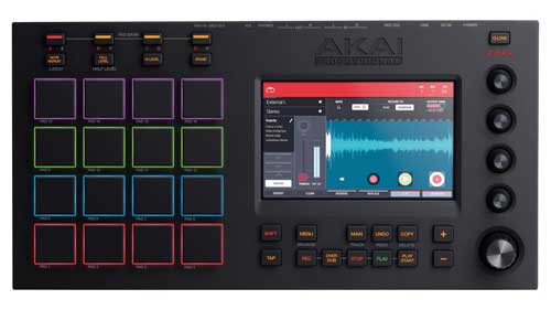
When it comes to iconic music-making gear, the Akai MPC sequencer/sampler/groovebox is definitely high on the list. Akai’s newest version of this classic beat-making machine is the MPC Touch — which pairs a 7″ color multi-touchscreen with the familiar grid of pads and step sequencer. The Touch works as a USB controller and audio interface with MPC 1.9 software running on your Mac or PC — but the new touchscreen makes it possible to close your laptop and work without worrying about the computer.
I sat down with Akai Professional’s Dan Gill and Pete Goodliffe for some serious gear talk. As a product manager for Akai, Dan was involved in the design of the MPC Touch. Pete heads up the MPC software development team in Cambridge, UK. And in addition to design, engineering and development — they’re also both musicians.
Adding a Touchscreen to the MPC
zZounds: How did the idea come about to add a touchscreen to the MPC?
Dan: Look at how everybody’s working these days…you’ve got this great touchscreen in your pocket. Most of us have a cell phone. You see the way technology is going with the Microsoft Surfaces, and things along that line. Nowadays, it’s so ingrained in our culture. You watch Iron Man, and you see Tony Stark swiping things in the air! This is the way our collective consciousness wants to work. It just made sense.
Pete: You look at the MPC Renaissance or the MPC Studio screen, and it’s a monochrome, small LCD thing. Nobody’s expecting to interact with that with touch. The next logical step clearly would be a sexier color screen, and as soon as you go full-color and have decent resolution, the expectation is there for touch.
Dan: We’d actually see this at tradeshows: We’d have the keyboard for the computer stashed underneath the kiosks. People would come up, and they’d see these computers showing off demos of the MPC software, and the first thing they would start doing is trying to touch the screen. They didn’t see a keyboard, so they started trying to touch the monitor. They assumed that the Mac they were looking at had a touchscreen on it.
We also have, of course, iMPC and iMPC Pro, which are our iPad apps. These products started bringing together touch and the actual feel of the MPC — and adding a touchscreen to the hardware was just another logical extension.
MPC Touch vs. the iPad
zZ: Do you see people using an iPad with a MIDI pad controller, trying to “fake” what you guys have built?
Pete: There’s a wide range of really awesome iPad apps out there, not just in the MPC space — an awful lot of really great iPad music apps. But very few people really like using those iPad apps live, because they aren’t tactile enough. Even though you have the beautiful glass display and you see lots of beautiful widgets, you can’t physically push buttons. You have to get some kind of controller to drive that…a separate drum pad or keyboard controller for the iPad app.
And that’s what we have crafted with this product. I call it the “best of glass” — with all the cool, fun stuff you can do on iPad. We have an XY control pad that you interact with on the surface of your screen. It’s kind of like a Kaoss pad, but the display is really showing you what’s going on under your finger. That is awesome!
Other iPad apps exist to do that, but we also marry that with the best of the physical controls. You have to have the pads to play, if you want a drum controller. There’s no substitute on glass for those really cool pads that we have. And the same with the knobs. You have physical controls married with that glass interface, and that’s something that basically only we can provide at this level at the moment.
Dan: The thing about an iPad is, you can’t bang it and you can’t twist it — and those are performance things that people want to be able to do, and that’s where the MPC Touch shines.
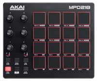
We do see people using the iPad with a MIDI controller, especially with iMPC Pro. Actually, the MPD218 — all the new MPD2 series pad controllers — will actually work in iOS mode. I think you power it on while holding Note Repeat.
But the thing about an iPad is, the software that people want to work with just isn’t available on an iPad. We hear people talking about Omnisphere all the time. People have their plug-ins on their laptop, so they need the power of that laptop to be able to do that.
Pete: They need pro performance.
Dan: Right. The iPad just falls short in that, at least for right now…people want pro performance, and they’re going to continue to go to the laptop.
zZ: What we’re seeing a lot of in the pro audio world, is people running around with their iPad as a wireless controller — but all the processing power is on the digital mixer. The iPad is just a control device; it’s not doing any of the processing.
Pete: That’s a strong model. I was doing a gig on the weekend and the sound guy was doing exactly that with an iPad. It’s cool that he can walk around the auditorium and mix the band from various places to make sure it sounds sweet everywhere. That releases a lot of restrictions. However, he will still go back to the desk. There’s nothing like having the actual flying fader control of what he’s doing. Glass gives you extra reach, but it isn’t the kind of tactile interface that you need. It’s more tiring just to use glass. Which speaks to why we’ve designed the MPC Touch like we have: we learn from all these things, and we get the best of both worlds. It’s the marriage of these two great technologies.
Taking Full Advantage of the Touchscreen
zZ: In addition to XY FX, what are some of the new features on the Akai MPC Touch that take full advantage of the touchscreen?
Dan: The first thing that’s absolutely fabulous to do on a touchscreen is sample editing. You can pinch to zoom and swipe to scroll through your waveforms. Editing the start and end points on samples is an absolute joy — I can’t believe I ever lived without it. We have a pencil tool that, with one touch, can slice up your waveforms and assign them to a pad. We have a grid view where you can draw notes on the screen — you can highlight a bunch of notes, and nudge them by timing division using the data wheel, or set it so they don’t snap to grid just by holding a button down.
The first thing that’s absolutely fabulous to do on a touchscreen is sample editing. You can pinch to zoom and swipe to scroll through your waveforms. Editing the start and end points on samples is an absolute joy — I can’t believe I ever lived without it.
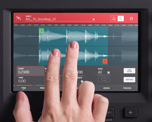 Pete: That in particular is really cool, because that shows where the hardware and the glass work well together. If you’ve used any other note editing on an iPad-style interface, it’s really quite fiddly to make fine adjustments to the notes. You can’t make a fine adjustment with just your finger — it really is not easy.
With what we’ve designed, you can quickly select things just by swiping over them with your finger on the glass. Then when you want to make a fine adjustment, you use the data wheel and just nudge things forwards and backwards exactly where you want them. So you’re in control. That combination of selecting things on the glass and using that control wheel — we’ve thought an awful lot about this kind of stuff.
One of the other really cool things we’ve added, that is utterly new for a touch interface, is a brand-new, massively improved step sequencer…so you still have that pad interface running past, but now you have this hands-on, big, graphical display of those steps. You can quickly dial in steps; quickly dial them out. You can adjust all the velocities of your steps just by sweeping your finger over the glass. That’s just something that was physically impossible — you couldn’t interact with your steps…on anything other than this, really.
We’ve added a brand-new, massively improved step sequencer…now you have this hands-on, big, graphical display of those steps. You can adjust all the velocities of your steps just by sweeping your finger over the glass.
zZ: Are you seeing users who got their start using a DAW with a keyboard and mouse instead of an MPC — so they’re used to having really detailed control over things like piano roll editing?
Pete: Yes…editing notes on an LCD interface, historically, has always been tricky and more like trying to operate a spreadsheet than playing music. You’ve got to put on your specs and lab coat to get into the nitty-gritty of editing MIDI.
Yeah, desktop DAWs allow you to interact with a mouse, but it’s not quite hands-on — you’re not physically touching the events you’re adjusting. Whereas the MPC Touch actually feels really cool, because you see the notes graphically as you would on the computer screen — but you can touch them, and then you can modify them by physical controls. It’s hands-on with your music. And people really do just “get” it.
zZ: Was that a conscious goal — a workflow that uses the computer screen as little as possible? We’re seeing that with DJ controllers, and even on the Akai Advance keyboard controllers — interfaces that encourage the user to do what they need to do on the controller, rather than on the computer screen.
Dan: Absolutely. The thing for me is — and I see this with a lot of users I’ve talked to — the moment that you’re sitting at a computer, putting your hand on the mouse, it’s almost a left brain vs. right brain thing. When somebody’s actually sitting at a musical keyboard, they’re very much in a creative mindset. As much as you can do to make sure that somebody stays in that mindset, the better.
That’s really been a goal from the beginning, with MPC. The MPC is a very visceral workflow. It’s the fastest way of getting something out of your brain and onto a piece of paper, to use an analogy. It’s really important that people be able to stay in that creative mindset for as much as possible. And with the new MPC Touch, you can actually close the laptop lid and still continue working. But there are people who are used to using a mouse and QWERTY keyboard, and that workflow is there for them too, if they want it.
The MPC existed for years and years as a standalone instrument…no computer screen. The MPC has always been about forgetting the computer and just diving straight into the music.
Pete: Remember, MPC has existed for years and years, before our current line of MPC products, as standalone instruments. That was the whole point — that there was no computer screen. What we did with this line, is we married the two. The MPC workflow is primarily a hardware workflow, so what we’ve built is primarily a hardware piece. Yet it attaches to your laptop, and it uses all the power from your laptop, and you can use all the plug-ins from your laptop. We have provided a rich graphical interface for you to do “lab coat” editing — but the MPC has always been about forgetting the computer and just diving straight into the music. And it continues to be that.
So the design of this touch interface…it’s not “slap our existing GUI into this big hole on this new piece of hardware.” We’ve hand-crafted a whole new paradigm for interacting with all the on-screen controls, and made everything as tactile as we possibly can. It just speaks to being immersed in that creative place, rather than switching up and having to grab a mouse.
With the old MPC with the LCD, you always had to cursor up and down to get to fields and then be able to increment them. Here, on this MPC Touch interface, you can just tap anything, and instantly you can adjust it with any of your data controls. We’ve just thought through exactly how that should be given to the user on that piece of glass, so they can understand and quickly get to anything.
Akai MPC Touch vs. Akai MPC Renaissance
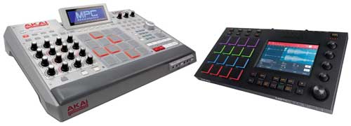
zZ: When I look at the MPC Touch vs. the MPC Renaissance, the Ren just says “old school,” and the Touch says “new school.” The Touch looks very, very modern, with RGB pads, and, of course, the touchscreen. Can you tell me about the industrial design process for the Touch?
Dan: The MPC Touch started out as some Illustrator concepts that I had drawn up. I kind of work with it like Legos: you take the 16 pads, you take the touchscreen, you take the knob, you take the buttons, and you kind of lay them out and figure out where you want them to go. We played with having the pads on the bottom, on the left, on the right — and you just print out those and have people try it and pretend they’re working on it, and you get a consensus on layout. We have an industrial design team who is awesome — they take my terrible napkin drawings, and they make them into a gorgeous product. This is one my favorite designs that they’ve done.
zZ: What is the audience for the MPC Touch vs. MPC Renaissance?
Dan: The Renaissance was a nod back to the old-school MPCs. It has a very traditional look to it, and a very traditional feature set. There’s always going to be the customer that prefers that style of working. The Renaissance has a lot of physical buttons, and there’s a lot of dedicated control on the Renaissance, whereas on the MPC Touch, there are fewer physical controls. We narrowed it down to the controls people want to use in a performance environment, or when they’re actively working. So I think there’s going to be a customer that appeals to, as well. The touchscreen is a huge leap forward — but even today, there are still guys who prefer to work on an MPC60, or there are people who prefer to work on an MPC2000XL. People always have their favorites.
Vintage Mode: The “Magic Behind the Scenes”
zZ: Our customers are fans of the “Vintage Mode” on the MPC Renaissance. Tell me about Vintage Mode, and how it works.
Dan: It’s a plug-in that is designed to emulate the converters and “magic behind the scenes” of the MPC60, MPC3000, and E-mu SP1200.
The SP1200 had a really cool thing where if you plugged in the jack halfway — or if you plugged in a TRS cable — the tip was filtered and the ring was unfiltered. And so the unfiltered 12-bit sound was really, really ringy and nasty-sounding. So it’s really cool in some applications, and not so cool in other applications. A lot of people like it for hi-hats, or if you’re pitching down a sample, it sounds really cool.
The original MPC60, when it sampled, its inputs would emphasize the high end going in, and then on playback, it would de-emphasize the same frequencies. So it allowed you to get sort of a psuedo-14-bit recording out of it. But the emphasis and de-emphasis wasn’t exactly linear, so it gave it a few interesting bumps in frequencies, and that’s what the MPC60 Vintage Mode emulates.

Classic samplers: the Akai MPC60, Akai MPC3000, and E-mu SP1200.
zZ: So you’re emulating something that you never really thought of as a feature in the first place — but that people came to love.
Pete: Our team did it — and we literally, physically modeled the hardware. We took those actual units and modeled the signal path through there, we took measurements, and then we reconstructed a code path that, as faithfully as we could, reproduced that in the digital world.
zZ: So, does the MPC Touch come with Vintage Mode as well?
Dan: It does! We have the Vintage Mode plug-ins inside the MPC software. In version 1.8, we added the ability to put Vintage Mode on each individual track — or even each individual pad, if you want. So you could have, for instance, an MPC60 snare, an MPC3000 kick drum, and a SP1200 hi-hat, if you want.
Pete: We added this in 1.8, and we completely unlocked it. You can have it on any audio channel. You can even have Vintage Mode per pad. So you can have a particular kick that you want with an old-school grit, and you can have it on just that pad, and leave the rest of your kit unaffected. That was in 1.8, so you can totally do all that stuff — and you can do it with touch, on the MPC Touch.
Plug-ins: What’s In the Box
zZ: Beyond built-in plug-ins like Vintage Mode, you mentioned using third-party plug-ins like Omnisphere in your MPC software…
Pete: Oh, I do that all the time! On Saturday, I was gigging, using my MPC as a multi-Omnisphere host. So I had 5 instances of Omnisphere on different tracks I’m driving with my keyboard controller, while I’m doing beats from my MPC. And then the 16 Q-Link knobs, I’ve arranged to control various parameters inside Omnisphere, or drive some filters over the top of it. That’s my performance axe. I’m Omnisphere and MPC mad!
Dan: You can have a VST or an AU plug-in on up to 128 tracks on your sequence. You can also use 4 effects per pad, and 4 effects per channel. And then we have different submix outputs, which you can also have 4 effects per. So yeah — we can run VSTs and AUs extensively — and MPC software can also run as a VST, AU or AAX plug-in inside of your DAW, too. And you can instantiate — and edit — your VSTs and your AUs right from the touchscreen.
zZ: Let’s say I don’t have a huge library of VSTs. What comes in the box with the Akai MPC Touch?
Dan: The MPC Touch will come with all the things that the MPC Renaissance came with. So it will include all the sound libraries — the Bank, the Wub, the Noise, and the 809. It also comes with Hybrid 3, which is an AIR plug-in that comes with the MPC right now. We’re also going to include Loom, Vacuum Pro, Velvet, XPand!2, the Mini Grand, DB33, and the Riser. Essentially, it’s the entire AIR instrument expansion pack, with the exception of Strike.
Pete: It’s really cool set of sounds you get straight out of the box. It’s worth pointing out that Hybrid 3 isn’t just a bundle VST, but actually, Hybrid 3’s built really deep into MPC. We spent a lot of engineering time getting that properly inside MPC, so it’s super-fast to launch, and super-well-integrated.
Dan: All told, the MPC Touch is going to be coming with about 20 gigs of content, and that’s going to include a new 10 gigs worth of content from of MVP Loops, and some new content by Cr2. The Cr2 Records production team is number one on the Beatport charts right now, so they’ve got some really cool dance-type sounds.
If you actually have an Advance keyboard, there’s some further integration with the VIP software [which is included with Akai Advance controllers]. The VIP software would appear first in your list of VSTs, and when you go into Program Edit mode, you can see all the controls that are automatable on the Advance keyboard. So if you have both, there’s some cool extra interaction that’s going on.
zZ: So you’re releasing MPC 1.9 software with the Touch?
Pete: This release will be called version 1.9 because of this entirely new way of interacting with the MPC. There’s a whole load of major features added that the Touch UI uses — but that existing customers [running MPC Renaissance or MPC Studio] can use too: independent track lengths, individual insert bypass, massively improved master mixer section, pad color control, continuous loop sample addition — a whole load of stuff.
So it’s not just that we’ve taken the existing MPC, and slapped a touch UI on it — there’s a load of extra new features in here as well. And development has not stopped here…There’s a whole road map of very strong stuff that’s coming later down the line, which if we told you about now, we’d have to kill you…so stay tuned.
The MPC software continues to be updated — and everything that we have added to this new release, all the existing MPC Renaissance and MPC Studio users will get…But obviously, the XYFX, the new step sequencer, and that kind of stuff — you need the new touchscreen hardware in order to use that.
“This is an instrument, not a DAW”
zZ: One thing I’ve heard people say about the MPC workflow is that it “forces you to be creative.” What does that mean?
Dan: I think it doesn’t really force you to be creative. I think it inspires you to be creative! To me, it just makes sense. You hit Record, and you hit Play, and you start banging on pads, and when the sequencer comes around again, everything locks into place and everything feels right. At the end of the day it’s a very visceral and good-feeling way to work. And that’s always been the MPC’s strength, right down to the MPC60. You can quickly load up a sound, hit play and record, and just start playing it, and then it just comes around on the beat, and you can start layering. It’s just a really fast way to get beats going.
The MPC Touch is the first time that we’re really able to bring a completely new way of working to the MPC, while retaining the old workflow. Things that are now better done on a touchscreen — that’s where the MPC Touch comes in.
Pete: Totally. It’s all about feel and workflow — I can’t agree more. When I first came into MPC, I was not a beat maker. I’m a keys player, so it was a little bit alien to me. But what I quickly got into understanding is — it’s super fun! You can very quickly build up something. You can layer things, and layer things. If it sounds really cool, you keep it. If it sounds rubbish, you literally just delete it and start again. That’s something that was really alien to me: throwing away stuff! You make a beat — that’s cool; I’ll keep it. You make a beat — that’s rubbish; throw it away. Sample something. Chop it up. That’s cool, or it’s not. And if it’s not, just throw it away. It’s enjoyable! If I did this in a project in a sequencer in a DAW, I’d feel like I had something of more value that I had to keep. But this is an instrument, not a DAW.
Dan: Early on in the development of the MPC Renaissance, we stopped thinking of it as a DAW, and started thinking, “this is an instrument.” It’s always been really important for us to maintain that feel: you’re not messing around with software or a touchscreen — you’re actually playing an instrument. I think this product achieves that really well.
The MPC Touch, for me, is the first time that we’re really able to bring a completely new way of working to the MPC, while retaining the old workflow. Things that are now better done on a touchscreen — that’s where the MPC Touch comes in.
Now, for the first time, you can literally grab a waveform, grab the sample you want, zoom in with your hands, touch notes on the screen. You can take a pencil now, and actually draw your notes on the screen. It’s a lot of fun. But at the same time, the MPC has always been famous for workflow. So we want to make sure we maintain the visceral workflow the MPC has always had. And I think we’ve done a pretty good job.
Pete: This has been in gestation for months and months…years! There’s been a whole team of really talented guys cranking out really great work to get this. And I’m really proud of everything that everyone’s put together — not just the software side that I head up. The development on this has been a serious undertaking and we’ve made something really very cool that has that a foot in the MPC workflow process, as Dan says, but totally takes it into the 21st century and beyond.
Find the Akai MPC Touch on zZounds



Leave a Reply